

[CSS]Change display:flex list to display:grid
I often use display:flex when I make a list of articles or products in css, but I wonder if I still have to use display:grid? So I’ll give it a try.
Personally, I’m used to display:flex, so I’m not very good at display:grid.
It’s fine for simple lists, but it seems to be able to handle quite complex layouts, and conversely, it makes me wonder every time “What’s that? How do I put it together? I’m not sure how to put it all together;
Well, let’s try display:flex as usual.
  <div class="list01">
    <div class="item">item</div>
    <div class="item">item</div>
    <div class="item">item</div>
    <div class="item">item</div>
    <div class="item">item</div>
    <div class="item">item</div>
  </div>
  <style>
    .list01 {
      width: 900px;
      background: #ddd;
      display: flex;
      flex-wrap: wrap;
      justify-content: space-between;
    }
    .list01 .item {
      margin-bottom: 25px;
      width: 32%;
      height: 100px;
      color: #fff;
      background: #000;
      display: flex;
      justify-content: center;
      align-items: center;
      position: relative;
    }
  </style>
When displayed in a browser, it looks like this.
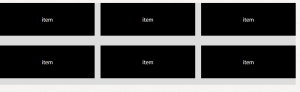
Now, let’s change the css part of this code to display: grid.
  <div class="list01">
    <div class="item">item</div>
    <div class="item">item</div>
    <div class="item">item</div>
    <div class="item">item</div>
    <div class="item">item</div>
    <div class="item">item</div>
  </div>
  <style>
    .list01 {
      width: 900px;
      background: #ddd;
      display: grid;
      grid-template-columns: repeat(3, 1fr);
      gap: 2%;
    }
    .list01 .item {
      margin-bottom: 25px;
      height: 100px;
      color: #fff;
      background: #000;
      display: flex;
      justify-content: center;
      align-items: center;
      position: relative;
    }
  </style>
This is what it looks like when displayed in a browser.
What I dislike about gird is that I dislike grid-template-columns (. I don’t like grid-template-columns (…);
I’ve specified repeat(3, 1fr), so it looks like 3 columns are lined up with the width of 1fr. I think it should be….